What were the poverty maps?
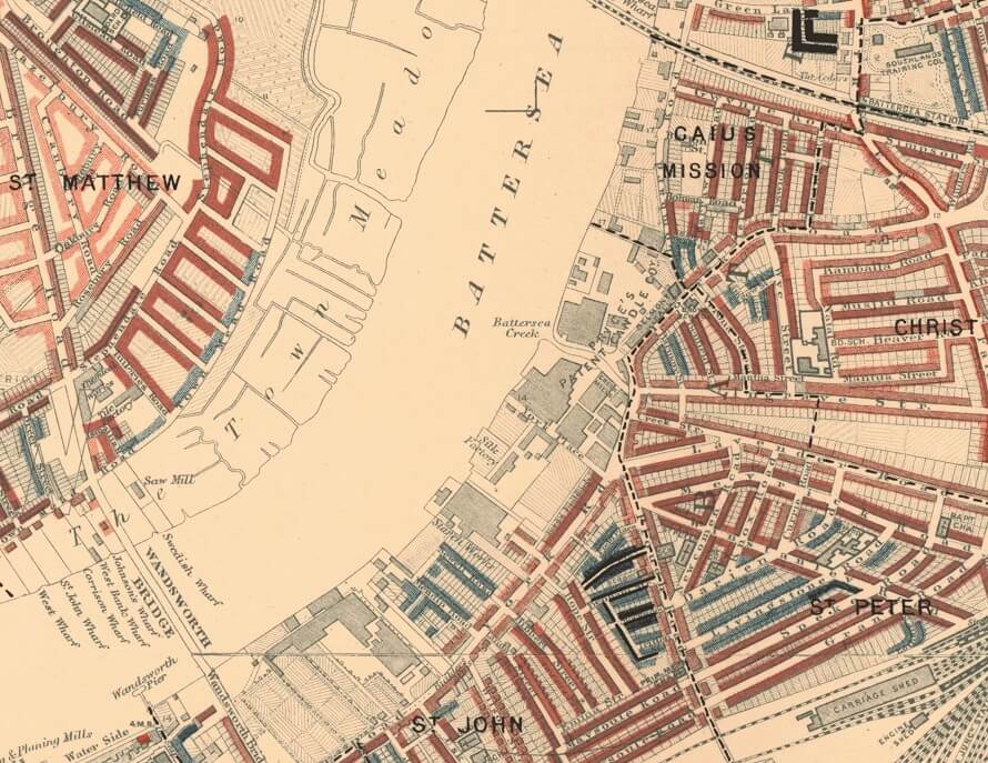
A section of map including Battersea and Wandsworth Bridge
The Maps Descriptive of London Poverty are perhaps the most distinctive product of Charles Booth's Inquiry into Life and Labour in London (1886-1903). An early example of social cartography, each street is coloured to indicate the income and social class of its inhabitants.
Classification of poverty
The seven classes are described on the legend to the maps as follows:
| Classification | Colour | |
|---|---|---|
| Lowest class. Vicious, semi-criminal. | Black |  |
| Very poor, casual. Chronic want. | Dark blue |  |
| Poor. 18s. to 21s. a week for a moderate family. | Light blue |  |
| Mixed. Some comfortable others poor. | Purple |  |
| Fairly comfortable. Good ordinary earnings. | Pink |  |
| Middle class. Well-to-do. | Red |  |
| Upper-middle and upper classes. Wealthy. | Yellow |  |
A combination of colours, such as dark blue and black, or pink and red, indicates that the street contains a proportion of each of the classes represented by those colours. The seven colour codes on the maps do not correspond directly to the poverty classification in the published survey: in the first volume of the poverty series in the final edition of Life and Labour of the People in London, Booth sets out an expanded poverty classification.
Interpreting the colours
It can be difficult to interpret the colours used on the maps. The colours of adjacent classes have not been chosen to emphasise distinction: in fact, similar classes have similar colours. This allows general trends across the city to be made apparent, although it can make identification at the street level more difficult.
It is worth noting that the light blue - "Poor. 18s. to 21s. a week for a moderate family." - and pink - "Fairly comfortable. Good ordinary earnings." - are not solid blocks of colours. If you zoom in to view these colours on the map hatching becomes apparent. This is a useful aid to interpretation where the shades may be similar to neighbouring streets. The compilers of the map also sometimes used a combination of colours to indicate that the street "contains a fair proportion of each of the classes represented by the respective colours".
Area covered by the digitised map
The 12 Maps Descriptive of London Poverty, 1898-9 cover an area of London from Hammersmith in the west, to Greenwich in the east, and from Hampstead in the north to Clapham in the south. The Charles Booth archive at LSE Library contains a possible thirteenth sheet, covering Woolwich (archive reference number: Booth/A/49). This sheet is not included in the map presented on this site, but an image of it can be viewed on LSE Library's Flickr account.
The City of London was not included in the street level survey because it did not house any significant number of residents. For this reason, the City of London remains uncoloured and unclassified on the maps.
Map editions
Descriptive Map of London Poverty 1889
The first edition of the poverty maps was based on information gathered from School Board visitors. A first sheet covering the East End was published in the first volume of Labour and Life of the People, Volume 1: East London (London: Macmillan, 1889) as the Descriptive Map of East End Poverty. The map was expanded in 1891 to four sheets - covering an area from Kensington in the west to Poplar in the east, and from Kentish Town in the north to Stockwell in the south - and published in subsequent volumes of the survey. These maps are collectively known as the Descriptive Map of London Poverty 1889. They use Stanford's Library Map of London and Suburbs at a scale of 6 inches to 1 mile (1:10560) as their base. A digital image of the 1889 map has been made by the University of Michigan.
The original working maps from this first edition of the poverty maps are held at the Museum of London. These are hand-coloured and use the 1869 Ordnance Survey 1:2500 maps as their base.
Maps Descriptive of London Poverty, 1898-9
The first edition of the maps had proved to Booth the value of social mapping of this type, and he felt that they were sufficiently important to warrant a comprehensive revision ten years on. Social investigators accompanied policemen on their beats across London, and recorded their own impressions of each street and the comments of the policemen. This information, gathered together in the police notebooks available on this site, was used to revise the street classification given for 1889.
The 12 sheets - covering an area from Hammersmith in the west, to Greenwich in the east, and from Hampstead in the north to Clapham in the south - were published in the survey volumes between 1902 and 1903. These maps are collectively known as the Map Descriptive of London Poverty, 1898-9. They use Stanford's Library Map of London and Suburbs at a scale of 6 inches to 1 mile (1:10560) as their base. It is this edition of the map that has been digitised and made accessible on this website.
The original working maps from this second edition of the poverty maps are held in the Booth Collection at LSE Library (LSE archive reference numbers: Booth/E/2/2 - E/2/61). They are hand-coloured and use the 1897 Ordnance Survey 1:2500 maps as their base.
More information about the maps can be found in Ralph Hyde's Printed Maps of Victorian London: 1851-1900 (Folkestone: Dawson, 1975).